Tips for the 'No Colour Scheme' Wedding
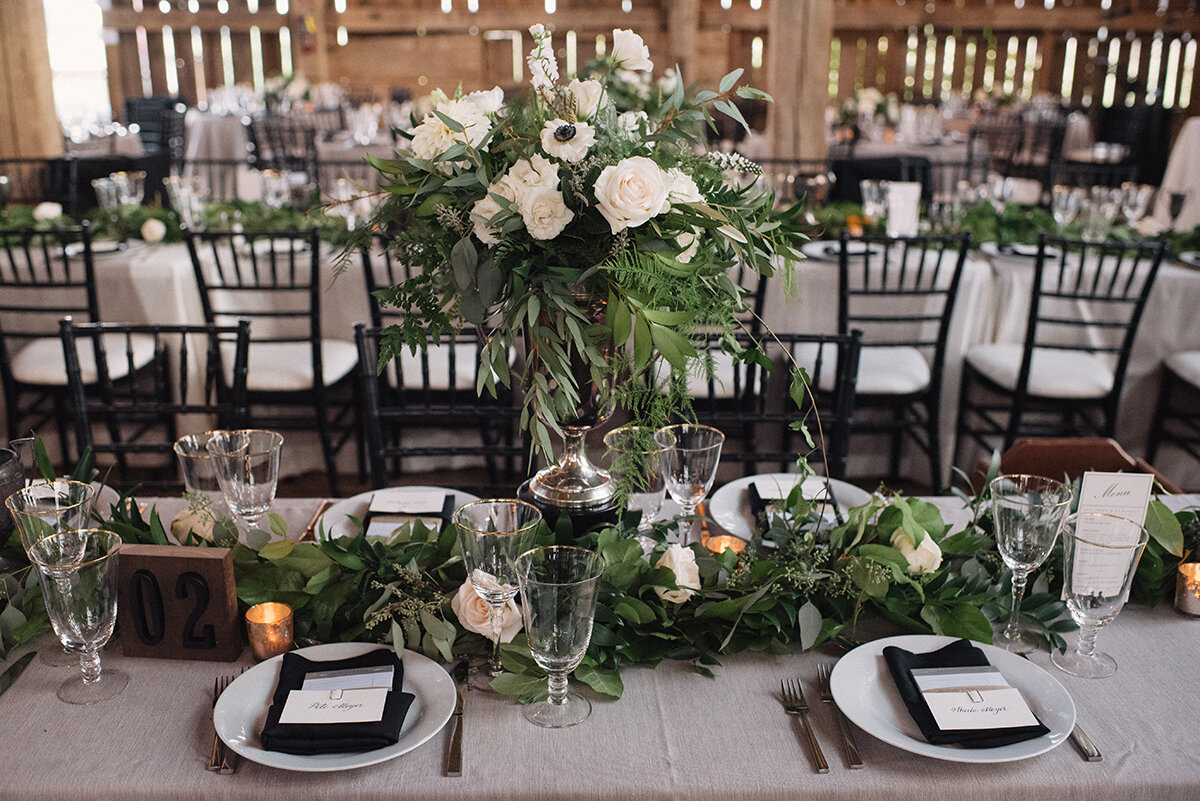
Photo by Hugh Whitaker — Floral arrangements by Karen Cal of Cedar & Stone Floral Studio.
Every bride gets asked the same handful of questions when they start planning their wedding: When is it? Where is it being held? What colours did you choose? Some of the answers are pretty straight-forward but I, like many others, found it tough to explain to friends and family that we didn't really have any wedding colours. In fact, I was adamant that there weren't to be any bright, bold, or saturated colours. I liked to describe the look we were going for as a 'no colour scheme' wedding.
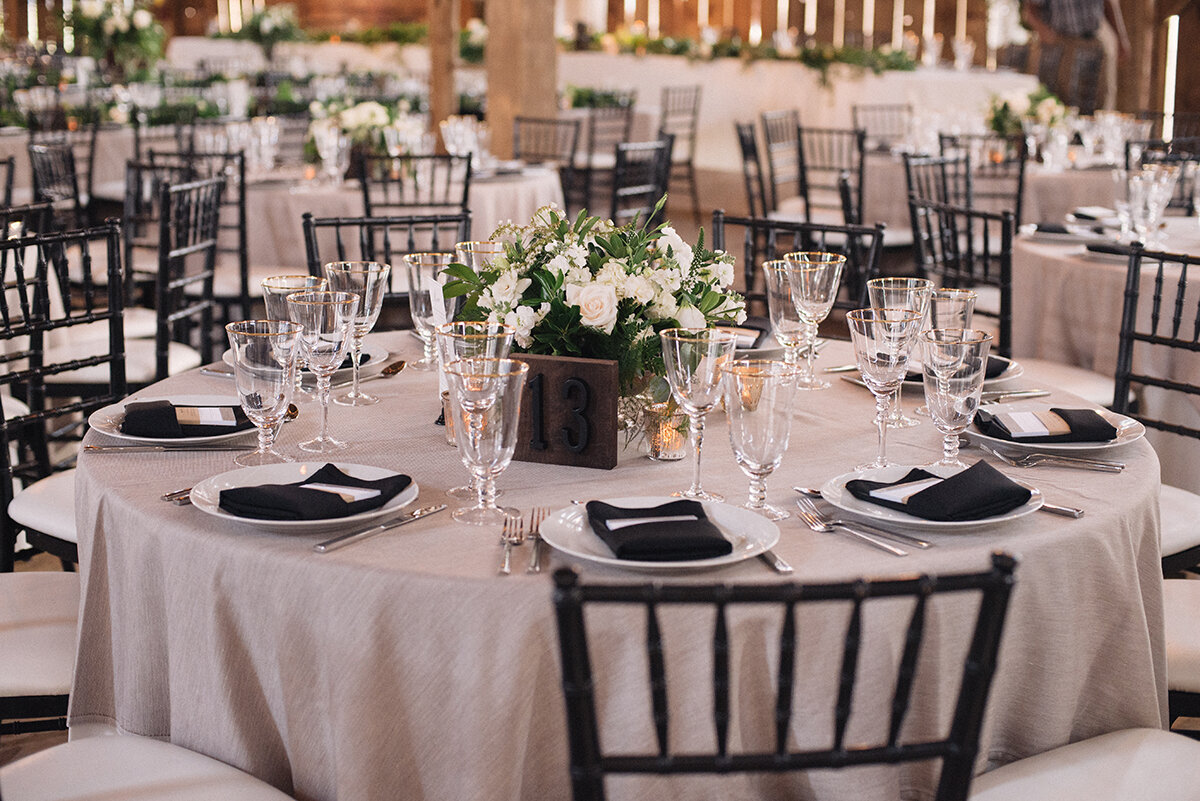
I got a lot of confused looks. Typically, some weddings will have one or two colours that are used throughout - in the decor, the bridesmaids' dresses, groomsmen's' ties, florals, etc. I told them there would be ivories, champagnes, browns, greens, gold and black. I think it was hard for people to picture without it looking boring and bland.
When I decided that our wedding party would be wearing black, I knew it was a bit risky. I was definitely trying to avoid it looking like a funeral. But to me, black means classic, timeless, sophisticated. And everyone looks good in black! It continued with black chairs, napkins, and decor items throughout. Lightened with the soft off-whites and brought to life with the green of the florals - it was exactly the mix of 'no colour' that I wanted. If you've been to my house, you'll see the same thing - neutrals, textures, metallics, and, you guessed it, no colour!
There are so many ways to exclude colour but still have everything look put together, interesting, and stylish. I'm here to share some ways that I think you can elevate a 'no colour scheme' wedding; avoiding eyebrow raises while highlighting your refined, neutral-loving taste.
1. THINK NATURAL
There are certain colours that appear at every wedding in one form or another - and that's because they exist in nature. Blues from the sky or greens in florals exist regardless of whether your wedding in held indoor or outdoor. For the 'no colour' wedding, bring in elements of nature that become a neutral among your other muted tones. Stone greys, walnut browns, icy blues - all stunning options that don't scream 'colour'.
2. TEXTURE TRANSFORMATION
There's such an amazing opportunity to play with texture once you take colour out of the equation. You'll likely have many different places to mix-and-match, juxtapose, and utilize textures. Whether it's wooden barn beams, soft linen draperies, lace napkins, burlap chair covers - you can have a lot of fun and make a bold statement with how you play up or play down surfaces. If your venue isn't particularly architectural and is more of a blank slate, really think about how you can use table cloths, chair selection, and interesting floral combinations to create the look you're going for. Is your theme modern and glamorous? Then clean lines and smooth, simple textures are great. Thinking rustic or bohemian? Then highlight intricate details and include tactile and woven textures. That's how you can drastically transform the same space without relying on colour to draw attention or create interest.
3. MORE METALS
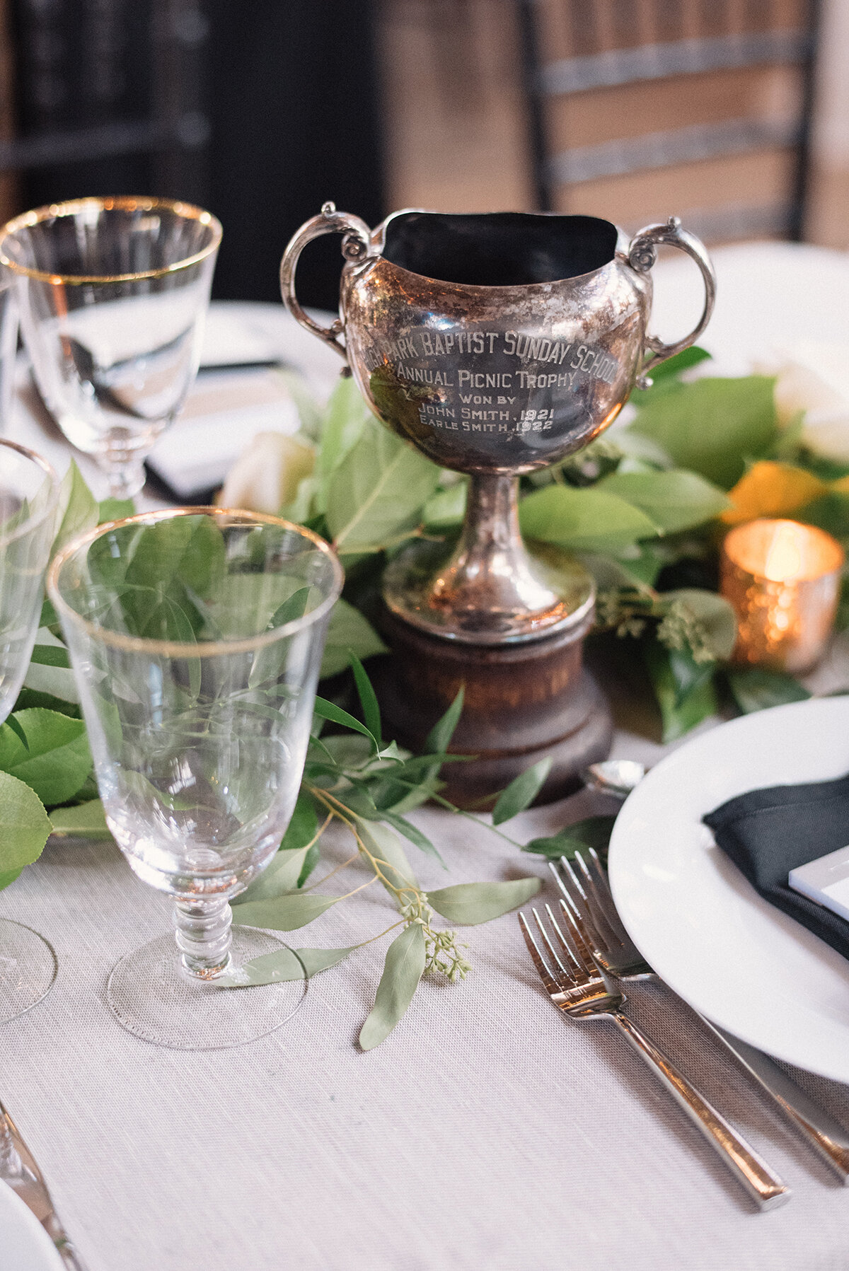
Metallics are a great way to add a touch of sparkle to your wedding decor. You already know some items will be metal (like cutlery) but try using metals in unexpected ways. In our case, we used mixed metals - antique silver in the form of trophy vases and a gold rim on the glasses (my absolute favourite!). You could also opt for gold cutlery or brushed silver chairs. I find that metals can add a subtle industrial vibe. They're also eye catching because of their shine. Whether it's direct light from a glowing sunset during dinner or the warm glow of string lights, metal elements can really steal the show. My vote? More metal, less colour.

'NO COLOUR' STATIONERY
For any wedding, save the dates and invitations are an introduction to what guests can expect to see on your big day. For the 'no colour' wedding, you can use the same tips I've included previously and apply them to your paper pieces! One of the most exciting steps for me while designing my invitations was selecting the type of paper. There are so many options in different thicknesses and finishes that you can have a lot of fun and reveal a lot of your wedding personality through just the paper alone. The best part is, paper tends to come in various shades of white - ideal for the 'no colour' wedding! In my case, I used a 100% cotton stock in the colour Natural - it has a vintage quality because it hasn't been bleached to the bright white we're used to seeing as printer paper. It's also perfect for letterpress, which inherently adds a beautiful texture to any piece. Combined with a black suede outer envelope (more texture) and an olive green RSVP envelope (introducing green as a neutral). For my metals, I included a wedding hashtag card in gold foil and held all the pieces together with silver regal clips. You can substitute any of these options with your own style and flavour - for example, warm greys rather than black for a softer overall look.

I hope these tips help all the 'no colour scheme' brides out there - I support you in your decision to stay neutral and refined in your wedding scheme. At the very least, you'll avoid looking back on your wedding photos decades from now and wish you hadn't chosen peach and teal as your wedding colours. High-five to the '80s.